
happy PATH
Wayfinding and navigation design concept
Project: Group project | Course INF1602
Location: Toronto
Date: Sept - Dec 2023
Tools: Miro, Figma, Figjam
Collaborative Role:
User Research
UX Design
Ideation
Prototyping
Pitching
Overview
Have you heard of the Toronto PATH? The underground pedestrian walkway in Downtown, Toronto? Have you every used it.. and have gotten lost? If you said yes, you're not alone! A large chunk of Torontonians, and even visitors to the city, share a similar exhausting experience of getting lost while using the PATH to get to a destination, even with the current wayfinding systems.
Follow along to learn more about the project:
happy PATH; the PATHs wayfinding kiosks, that assists pedestrians while navigating.

Understanding the Problem.
Take a look at this. One of many reddit posts with long threads and conversations about local Torontonians and visitors, sharing their similar frustrations and disappointments with the PATH. Although the PATH has its advantages, such as it's cleanliness and usefulness, we gained further insight into their issues and frustrations with the current wayfinding resources.

image source: http://www.quickmeme.com/meme/3s6k7c
From our secondary research, we found the challenges pedestrians face while navigating through the PATH to be:
-
Spotty and unreliable cell service for GPS use
-
Confusing signage that leads users into dead ends
-
Confusing wayfinding maps with disorienting "you are here" markers
-
Different maps throughout the PATH depending on the building you are in
-
Random color coded compass directions
-
Lack of amenity information, such as location and hours
-
The web-based digital map, Pathmap.ca, has made navigation more complicated to understand (see here)
Our focus:
Improve the navigation experience for pedestrians, both local and visitors, who use the Toronto PATH to get to a destination.
Primary Research
Our primary research focused on 3 methods of collecting data:
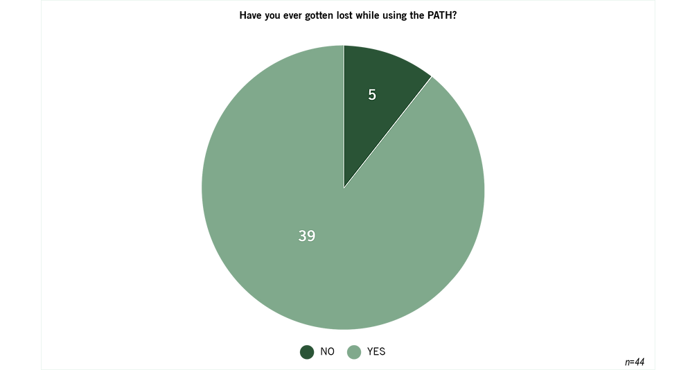
We collected 46 survey results, gauged users overall feelings and perceptions, their challenges and appreciations, and previous experiences and reasons for using the PATH.
We asked 12 interviewees a set of questions, after passing the screening and agree to consent. They provided us with in-depth information of their experiences using the PATH, their struggles, appreciations and suggestions.
Observations (view images)
We conducted in-person observations in the PATH during various times/days to get a deeper understanding of the current environment and wayfinding tools.
Survey data
"The PATH to me is a rabbit hole, it seems to be designed without logic and not for human use."
Interview data
"The maps and directions are so hard to read sometimes, and have too much information on them"
Interview data
We observed a user using the existing wayfinding map, Google maps and a compass; and was still confused.
Observation data
Let's introduce our Persona.
Age: 23
Location: Downtown, Toronto
Occupation: Finance Consultant
image source: freepik

I'm Lost Lisa!
"I need a better way to meet with my clients within the Downtown core, especially during winter months."
Goals:
-
Clearer directions to navigate from point A to point B in the PATH
-
Ensure timely arrival to work and client meetings
-
Seek shelter from severe weather conditions
Pains:
-
Difficulty with position/orientation relative to streets
-
Unreliable underground cell service
-
Trouble finding entrances/exits
-
Encountering dead ends
-
Unfamiliarity with buildings names on maps/signs
Desires:
-
Improved maps and signage
-
Detailed amenity information
-
Enhanced accessibility
-
Offline navigation capability for directions without reliance on cell service
Since Lost Lisa moved to downtown Toronto to start her new job she’s been having a major issue getting to work and around the city. With winter approaching and her frequent need to get around the city to meet clients, she’s been determine to utilize the PATH. But every time she’s in there she finds herself confused, defeated and unable to figure out where she is or what building she’s supposed to exiting at. Lost Lisa needs a solution to navigate around the PATH without getting lost!

Defining the vision.
Lost Lisa needs a solution to navigate around the PATH without getting lost.
-
Identify her current location so that she can feel confident about her route.
-
Know the location of the amenities/services so that she can better utilize the PATH.
-
Avoid unpleasant weather so she can arrive comfortable and presentable.
Ideation.
Digital


Analog + Digital

Analog
Once we had all of our big ideas, our team evaluated and voted on the impact and feasibility of each one of these ideas.
Through this exercise, we identified our marginal gains ideas, high impact but low feasibility, like the “Tour guide.” We identified more achievable ideas, or quick wins, like "Street name indicators" that are achievable but less impactful. After that, we have our big bets! High impact but not so feasible ideas, like “Augmented reality."
Our home run consisted of big ideas that we felt were high with impact and feasibility for Lost Lisa. This idea is the wayfinding kiosk, an interactive kiosk that offers navigational assistance and provides personalized directions and maps for people like Lost Lisa to reference to or link to their own device.


We brainstormed and designed a low-fi storyboard with 3 task flows that adhere to Lost Lisa's needs.
Task flow 1
-
Enables users to search for personalized destinations along the PATH before arrival, and save the route for navigation when required.
Task flow 2
-
Enables users to zoom into a specific location, including their current location for orienting purposes and select destinations on the map to get to.
Task flow 3
-
Enables users to browse the directory for amenities and services, identifying the closest options based on their current location.

Usability Testing.
We tested our low-fi prototype with representative users.
We conducted a lean evaluation testing, specifically guerrilla usability testing, with a low-fi paper prototype to test our solution for Lost Lisa. We asked 2 representative users for 15 minutes of their time to test the scenarios in-person, we asked non-leading questions and encouraged them to to think-out loud. We then evaluated further and enhanced the solution for Lost Lisa for the mid-fi prototype.

Prototyping.
After analyzing the feedback from the lean evaluation, we made changes to add to our Mid-fi prototype to improve Lost Lisa’s experience. Let’s take a look at how our new Kiosk will now help Lost Lisa get from point A to B.

A combination of evaluation methods were used to gather data during our interview usability testing to see if users can fulfill their needs and complete specific tasks successfully. The testing was semi-structured through a moderated and think-aloud approach.
We set goals, questions (see here), instructions, script, procedure and selected participants based on recruitment criteria to guide us during testing. We planned, scheduled, considered potential practical and ethical issues in advance and ran the evaluation sessions.
We then revised our Mid-fi prototype with the insights and analysis gained from the evaluation testing and made note of elements to include for next steps, to continue improving our solution for Lost Lisa. Below is a few take aways and future suggestions from the participants.
"I like having the ability to zoom in or out to get a better understanding of my destination and the directions I should be going in ."
Evaluation testing data
"I like that I have the ability to search for a destination before I arrive and save the route for when I need to use it."
Evaluation testing data
"I think the route steps could be more intuitive such as adding images or more information, this may help with the confusion of navigating."
Evaluation testing data
Takeaways.
We tested our low-fi prototype with representative users.
Going forward, we are looking to expand our solution’s device compatibility to encapsulate a wider range of devices such as desktop computers and smartphones, allowing people to plan ahead and utilize their device’s set language. We aim to further evaluate existing navigation software to determine whether we should follow commonly used design patterns or improve/customize certain components (e.g. map markers) for ease of understanding. Addressing accessibility considerations will also be key, such as looking into enabling spoken commands or incorporating a built-in screen reader for our solution.
My project takeaways:
-
Designing with time and feasibility in mind is important since it will guide the solution, features and allow the team to focus on what's important for the user
-
Improve the design with multiple iterations and testing to ensure the solution can meet the needs of the user. Additionally, adding a second or third persona will be ideal in creating a solution to fit majority users of the PATH and offer the most user effective solution. (Ie. a user who is new to the city and visiting Downtown during winter months)
-
Add UI elements to make the solution look further developed, while ensuring it relates to the current design of the PATH.